Love letters
Identity design
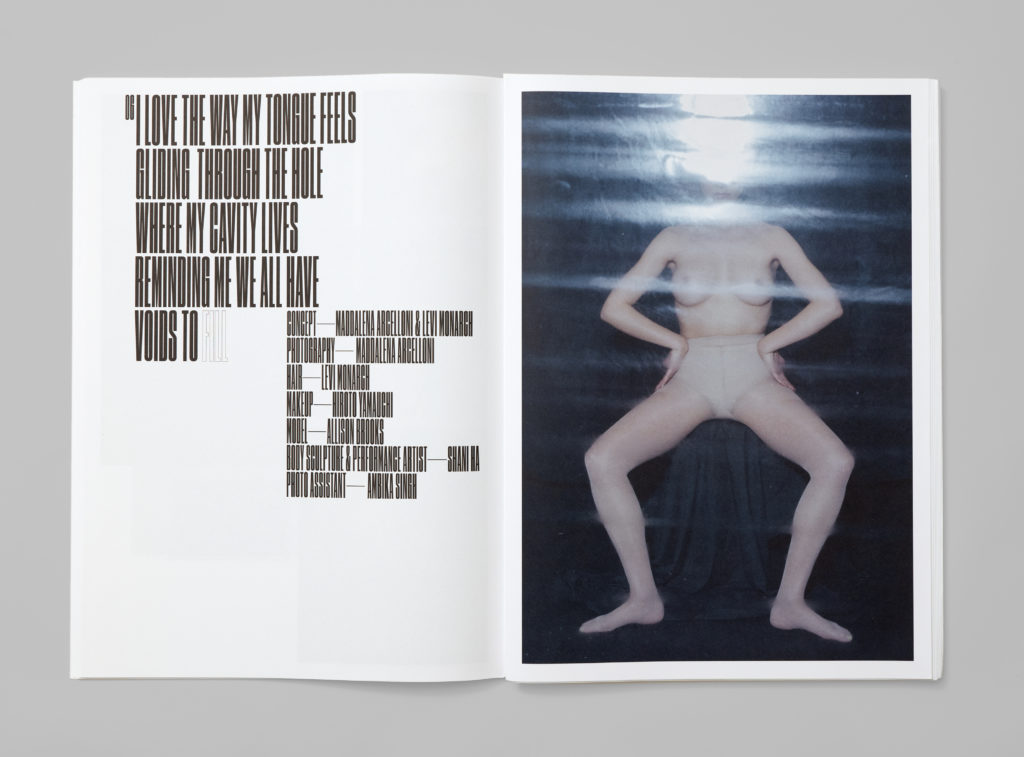
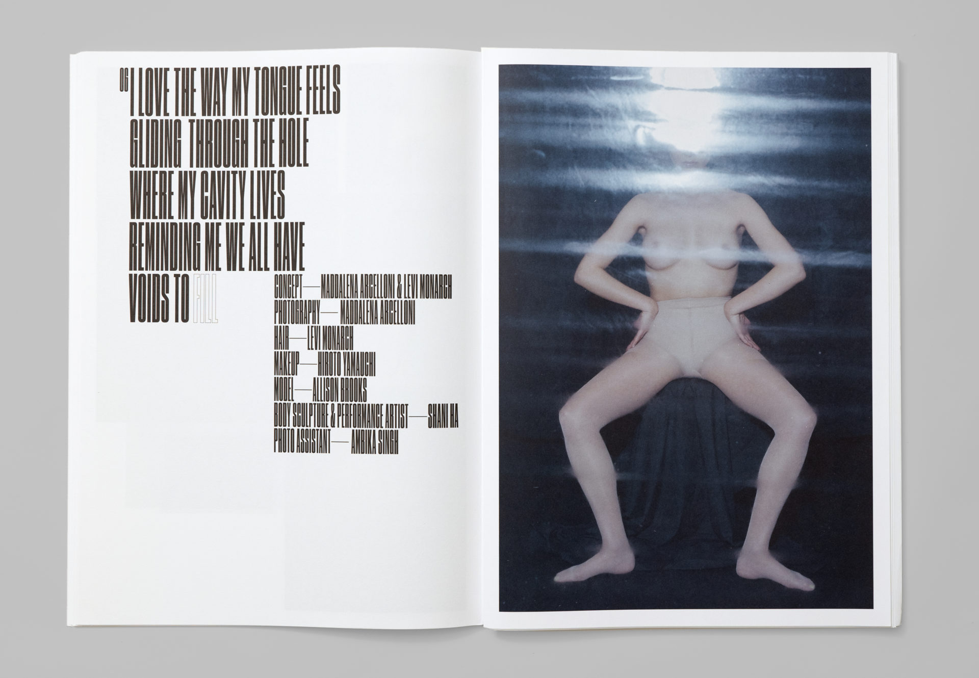
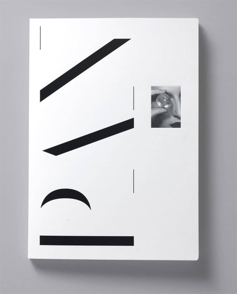
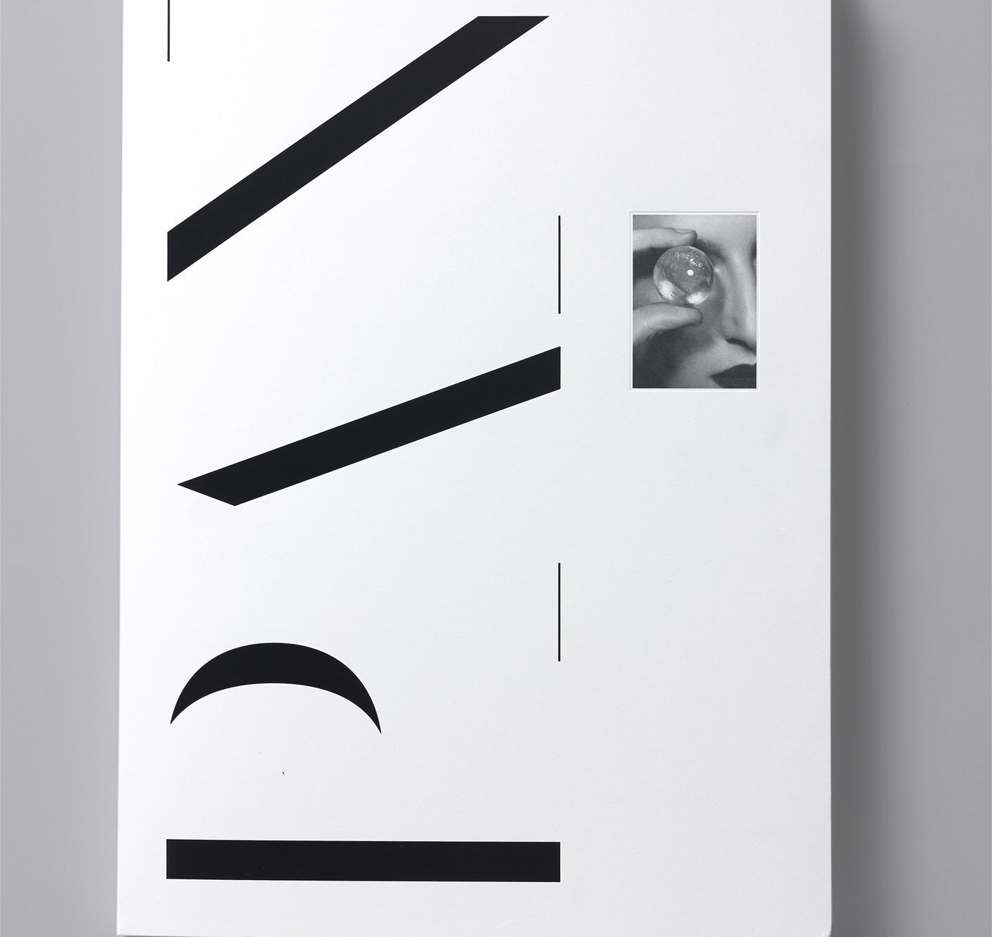
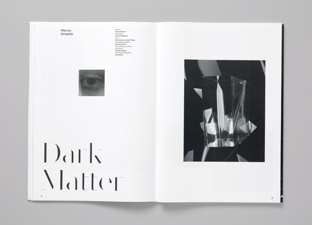
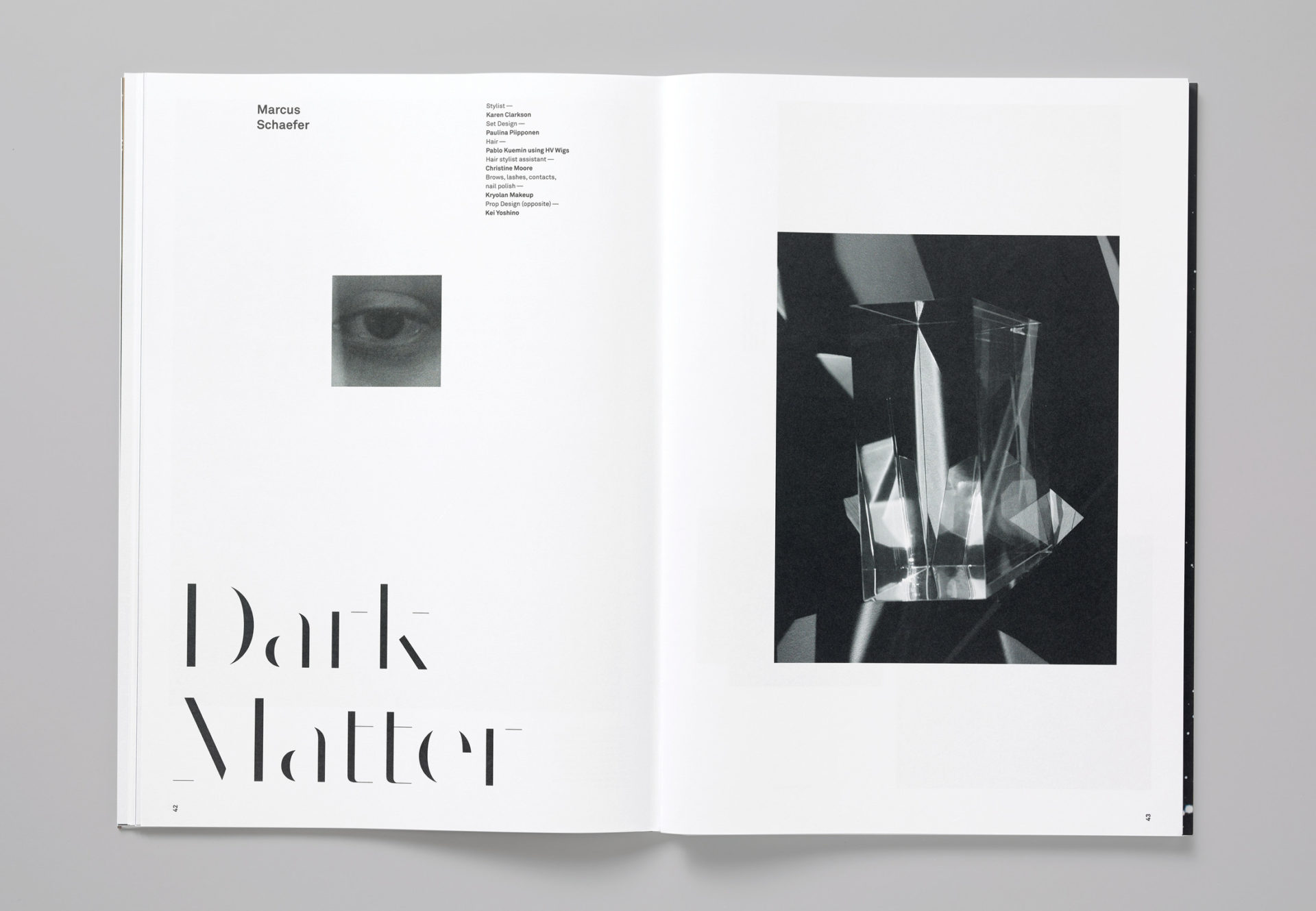
PAN—5
Editorial design
kyndryl logo
Identity design
IBM Plex Sans
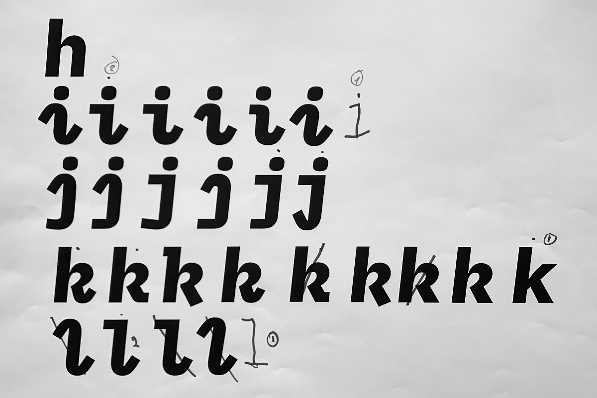
Typeface design

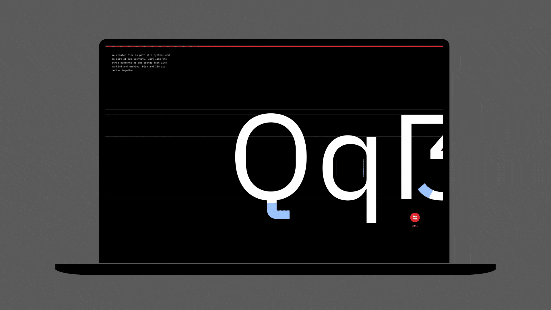
IBM Plex Microsite
Editorial design
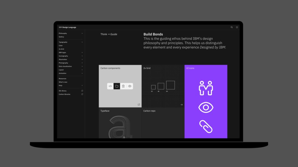
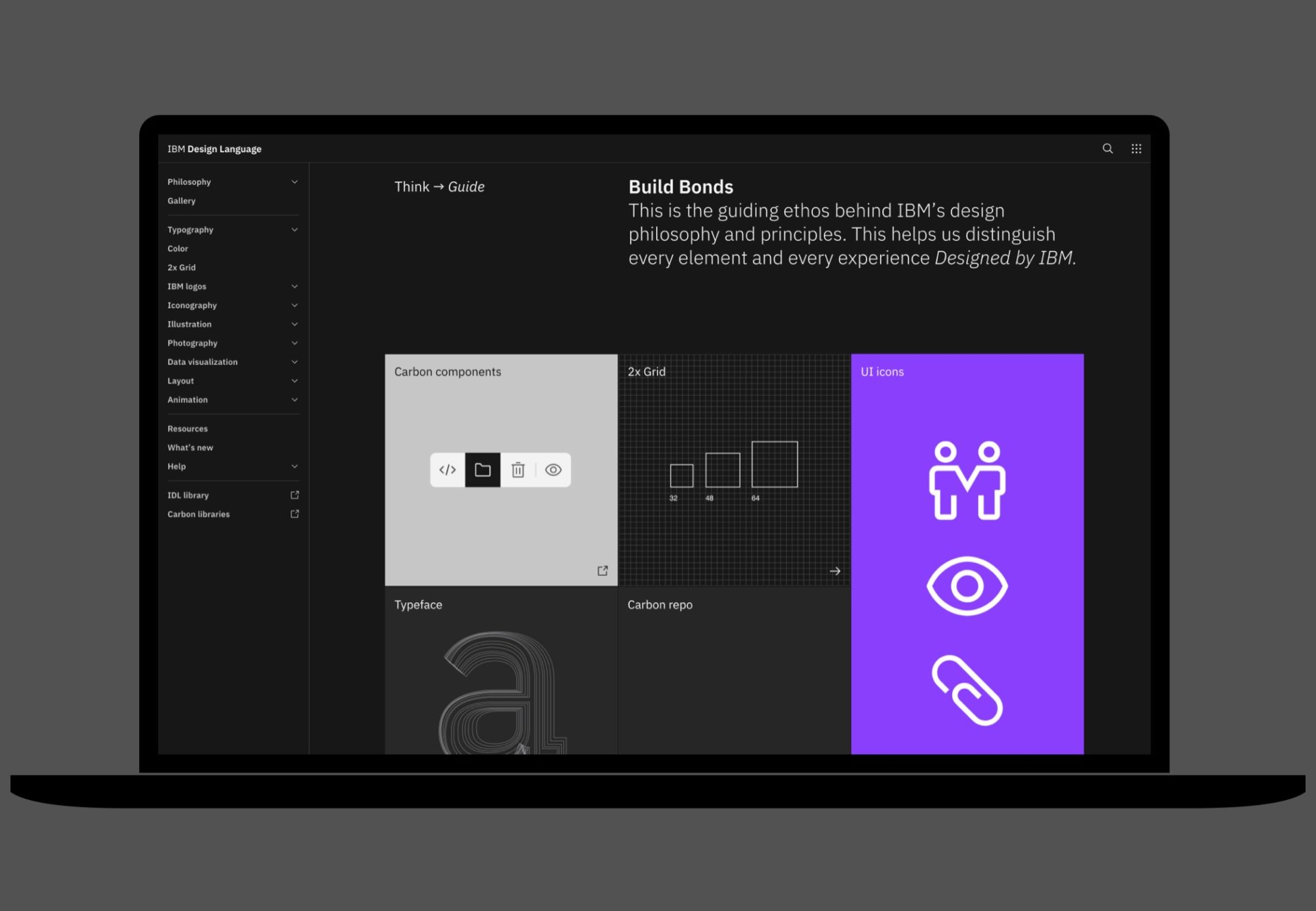
IBM Design Language
Identity design
IBM 2x Grid
Identity design

IBM Design System
Identity design

IBM Plex Mono
Typeface design
IBM Plex Serif
Typeface design
IBM Plex
Typeface design
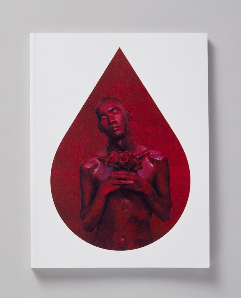
Perfect Strangers
Editorial design
PAN—3
Editorial design
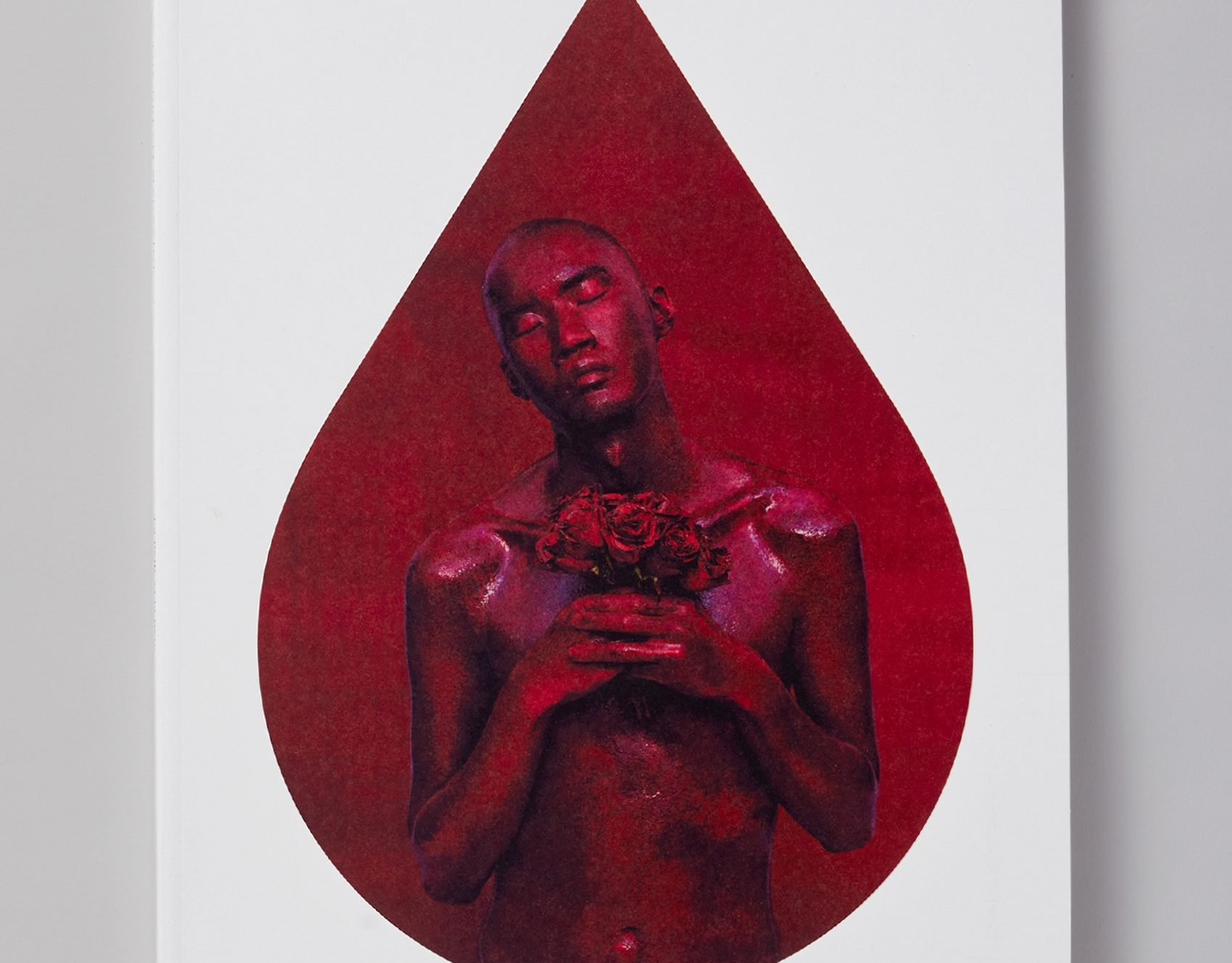
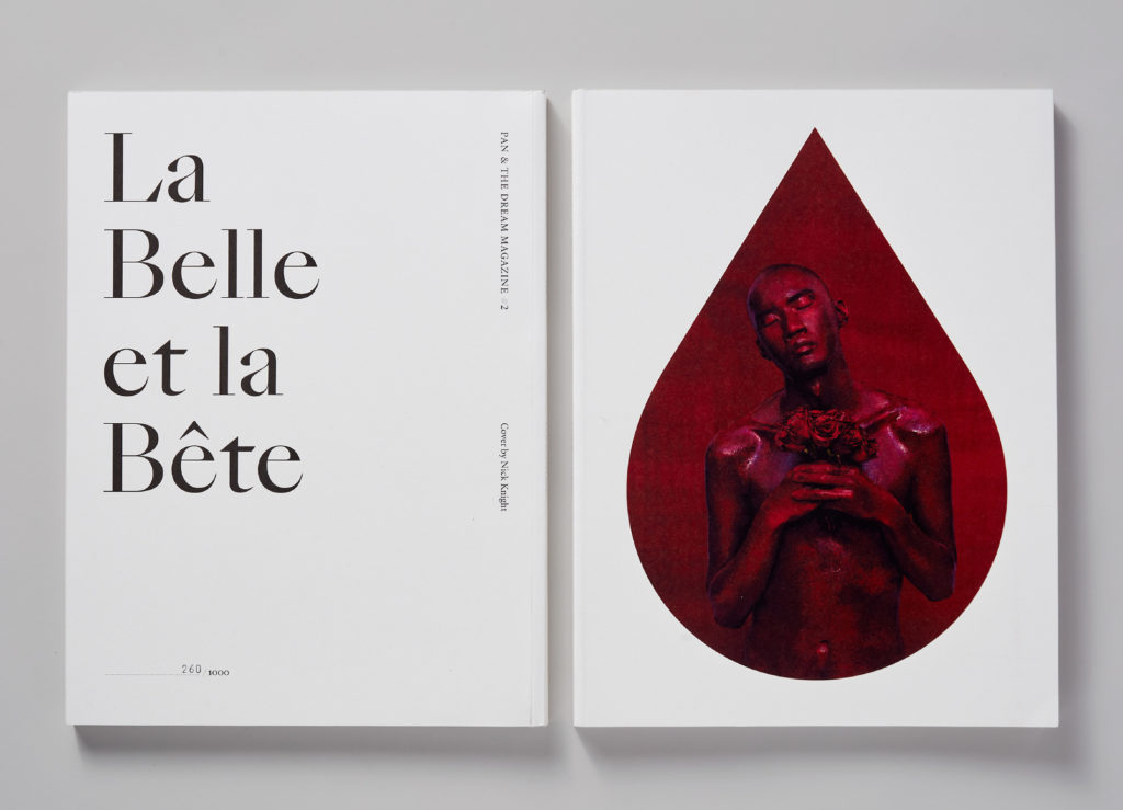
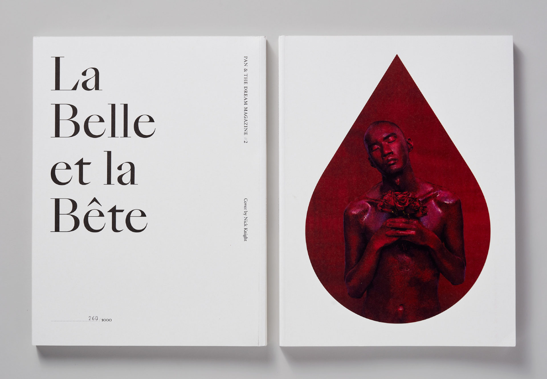
PAN—2
Editorial design
FF Kievit® Serif
Typeface design
Brando Sans
Typeface design
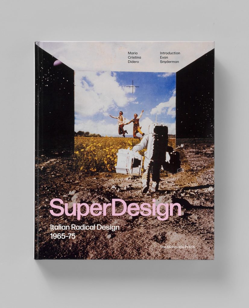
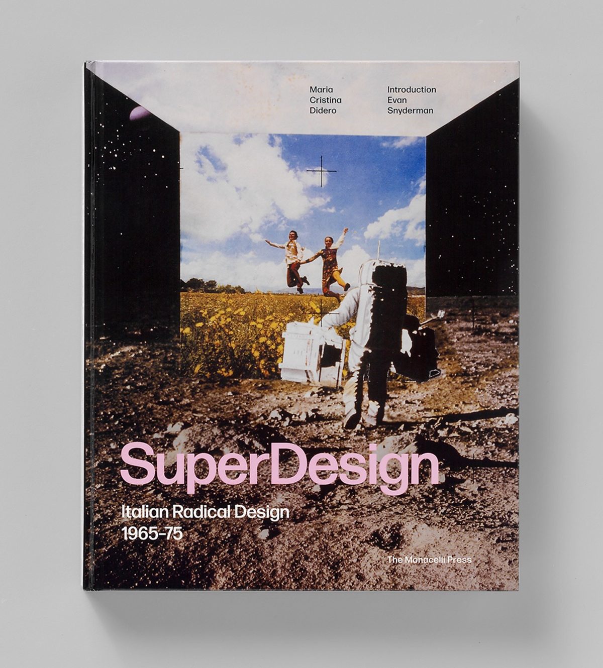
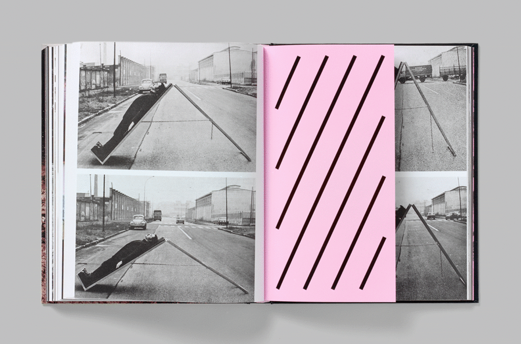
SuperDesign 1965–75
Editorial design

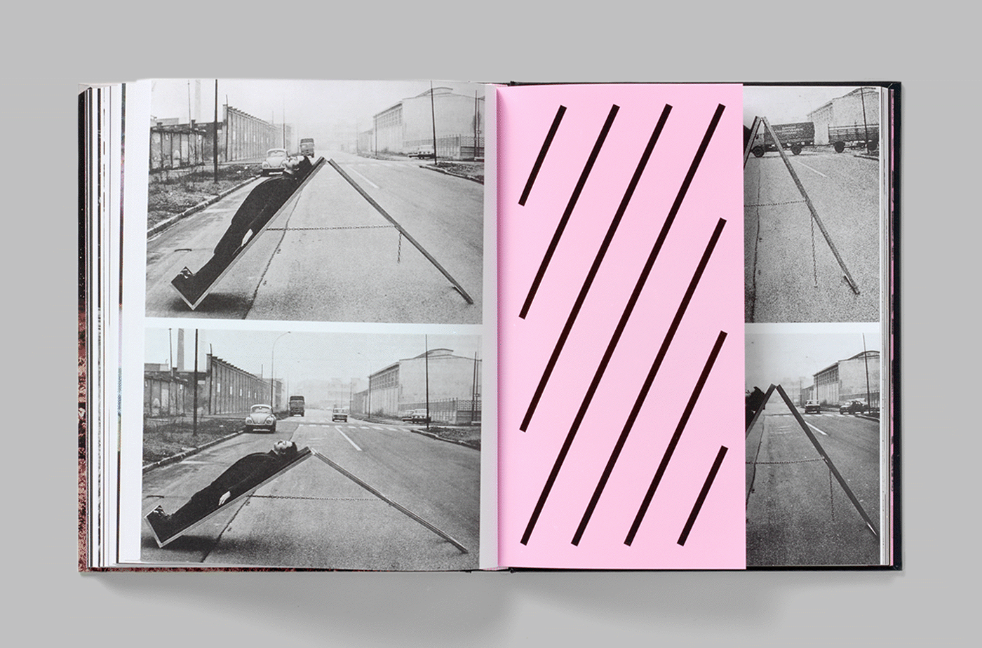
MoMA: Matisse
Identity design
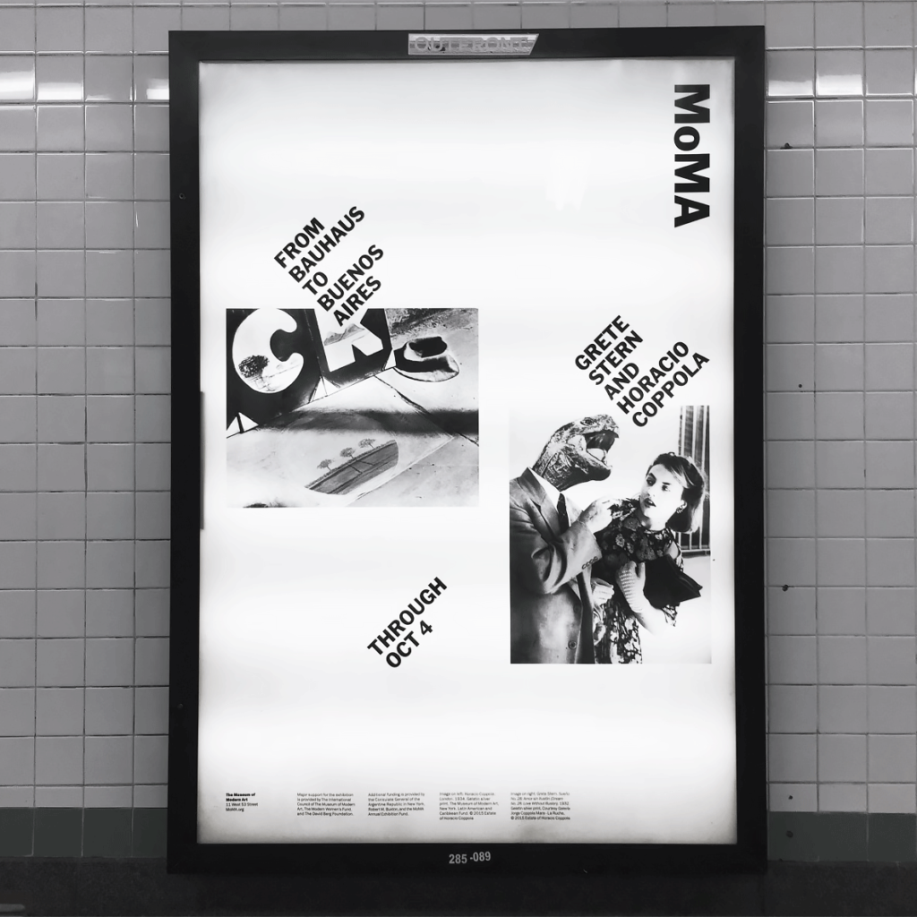

MoMA: Outdoor
Coming soon
FF Milo® Slab
Typeface design
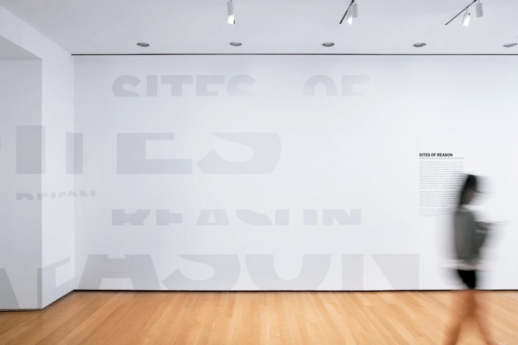
MoMA: Exhibitions
Identity design
NBCU logo
Identity design
NBCU Woman logo
Coming soon
Belkin logo
Identity design
Apollo logo
Identity design
FF Milo® Serif
Typeface design
GE Inspira Sans
Typeface design
GE Inspira Serif
Typeface design
The Sill™
Coming soon
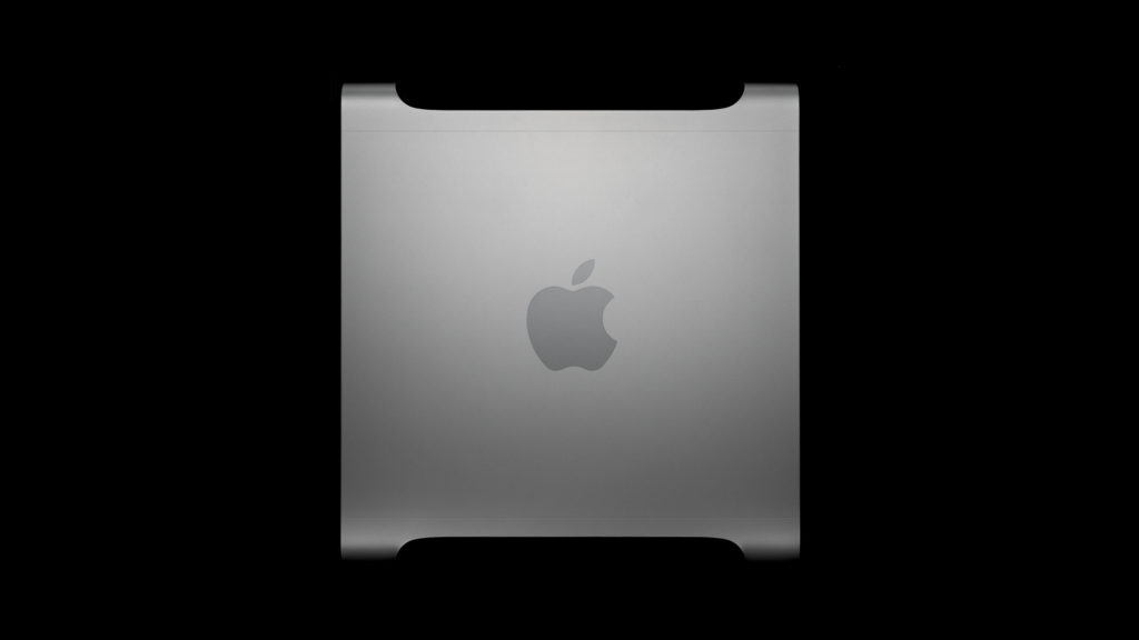
Power Mac G5
Identity design
Airport Extreme
Identity design